EBS intel Changes for 4.31
The following key product changes have been made to EBS intel:
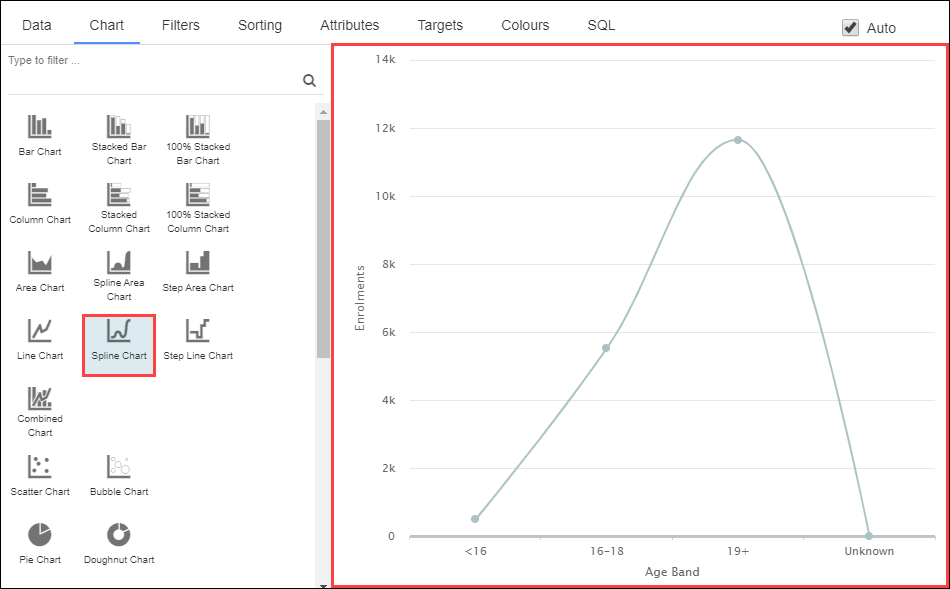
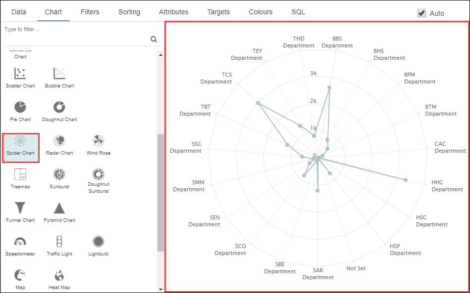
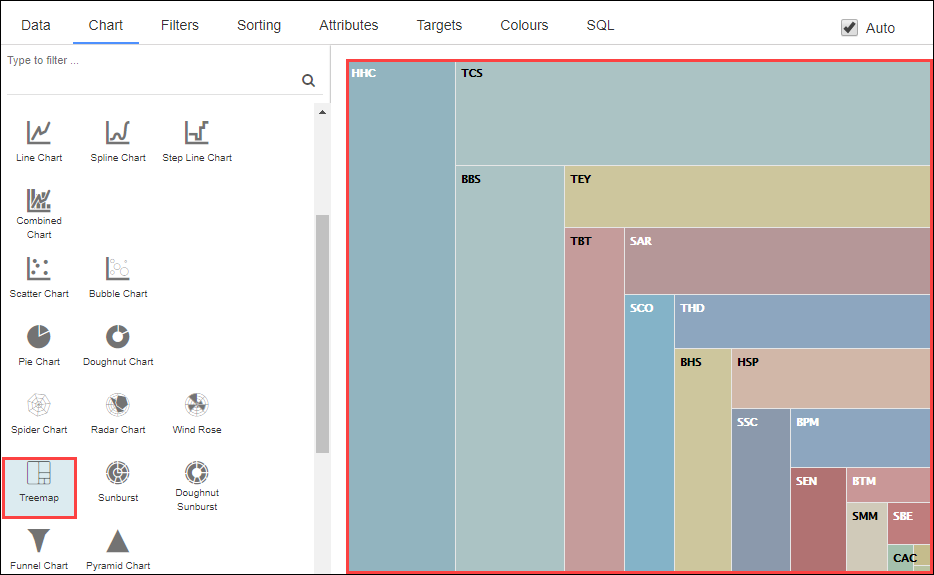
The following charts can now be selected in the Chart tab:
-
Spline Chart
-
Spider Chart
-
Treemap
-
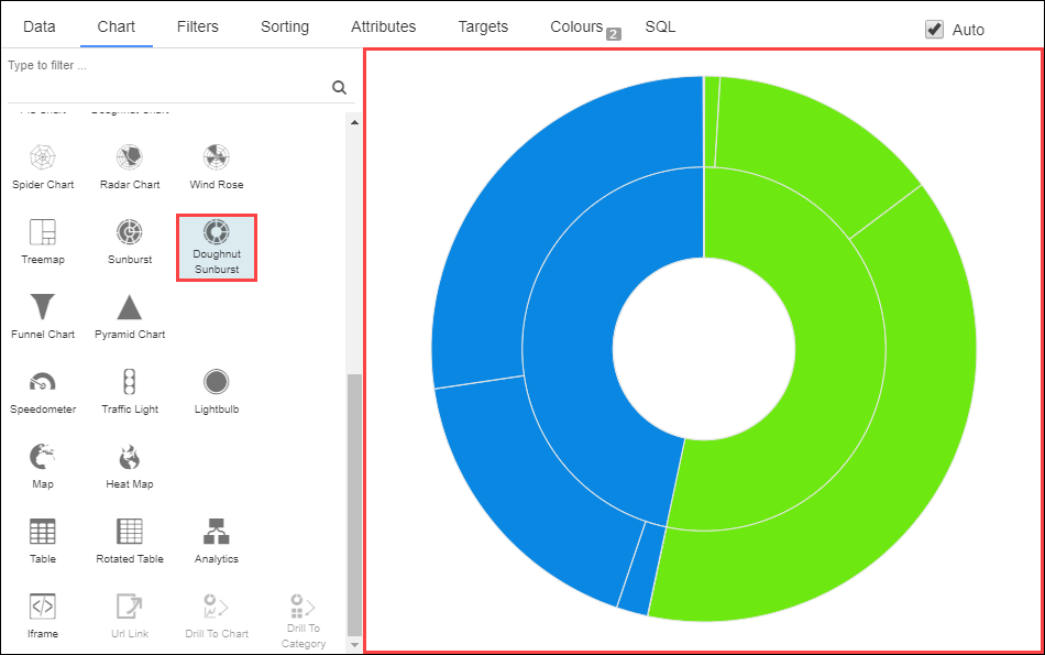
Doughnut Sunburst
-
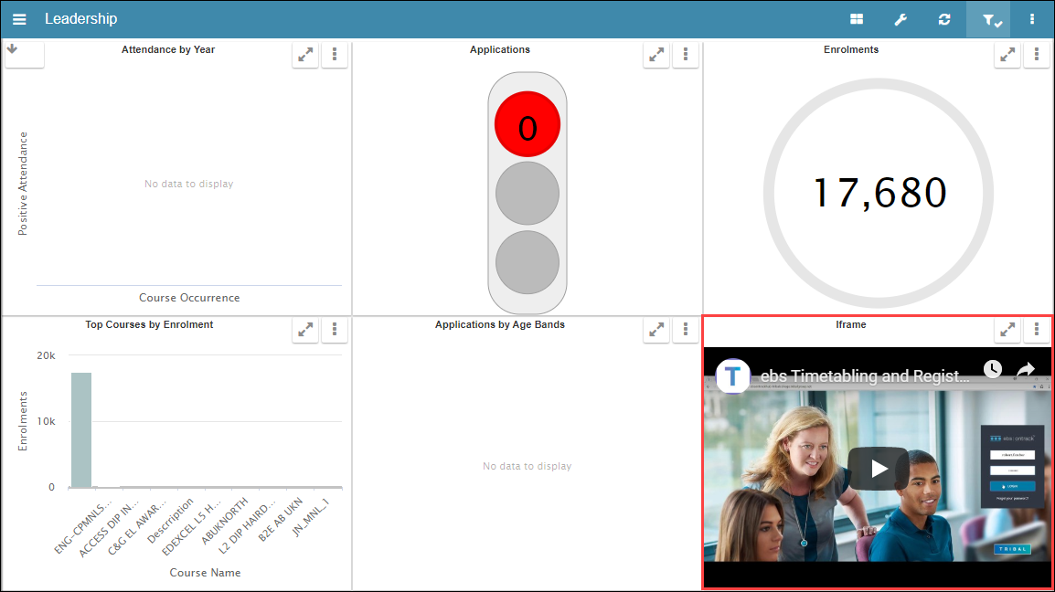
Iframe
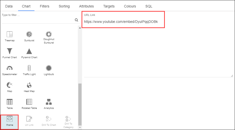
Enter a URL link (including the 'http://' or 'https://' prefix) to display the output on the dashboard.
The following table describes the recommended use for each chart type (including existing ones).
| Use this chart | For this purpose... |
|---|---|
| Bar Chart | When you want to compare value sizes. |
| Stacked Bar Chart | When you want to view proportions, the data is multi-dimensional and the proportion is more important than absolute value. |
| 100% Stacked Bar Chart | When you want to view proportions, the data is multi-dimensional and the absolute value is more important than proportion. |
| Column Chart | When you want to compare value sizes and you have long labels or want to show rankings. |
| Stacked Column Chart | When you want to view proportions, the data is multi-dimensional and the absolute value is more important than proportion. |
| 100% Stacked Column Chart | When you want to view proportions, the data is multi-dimensional and the proportion is more important than absolute value. |
| Area Chart | When you want to look at continuous values or trends over time. |
| Spline Area Chart | When you want to look at continuous values or trends over time. |
| Step Area Chart | When you want to look at continuous values or trends over time and highlight the irregularity of changes. |
| Line Chart | When you want to look at continuous values or trends over time. |
| Spline Chart | When you want to look at continuous values or trends over time. |
| Step Line Chart | When you want to look at continuous values or trends over time and highlight the irregularity of changes. |
| Combined Chart | When you want to look at a correlation (or lack thereof) between data sets. |
| Scatter Chart | When you want to look at the relationship between two numerical values. |
| Bubble Chart | When you want to look at the relationship between three numerical values. |
| Pie Chart | When you want to view proportions and the data is single-dimensional. |
| Doughnut Chart | When you want to view proportions and the data is single-dimensional. |
| Spider Chart | When you want to look at multiple performance measures. |
| Radar Chart | When you want to look at multiple performance measures. |
| Wind Rose | When you want to look at multiple performance measures. |
| Treemap | When the data is hierarchical. |
| Sunburst | When you want to view proportions, the data is multi-dimensional and the absolute value is more important than proportion. |
| Doughnut Sunburst | When you want to view proportions, the data is multi-dimensional and the absolute value is more important than proportion. |
| Funnel Chart | When you want to look at completion stages. |
| Pyramid Chart | When you want to show data in a progressive order. |
| Speedometer | When you are looking at a single value and the range where the value falls is important. |
| Traffic Light | When you are looking at a single value and only the current status is important. |
| Lightbulb | When you are looking at a single value and only the current status is important. |
| Map | When the data is geographical and the precise location is important. |
| Heat Map | When the data is geographical and loose clustering is important. |
| Table | When exact values are important. |
| Rotated Table | When exact values are important. |
| Analytics | When you want to be told what the most important characteristics are. |
| Iframe | When you want to embed HTML. |